Create Room Rebrand:
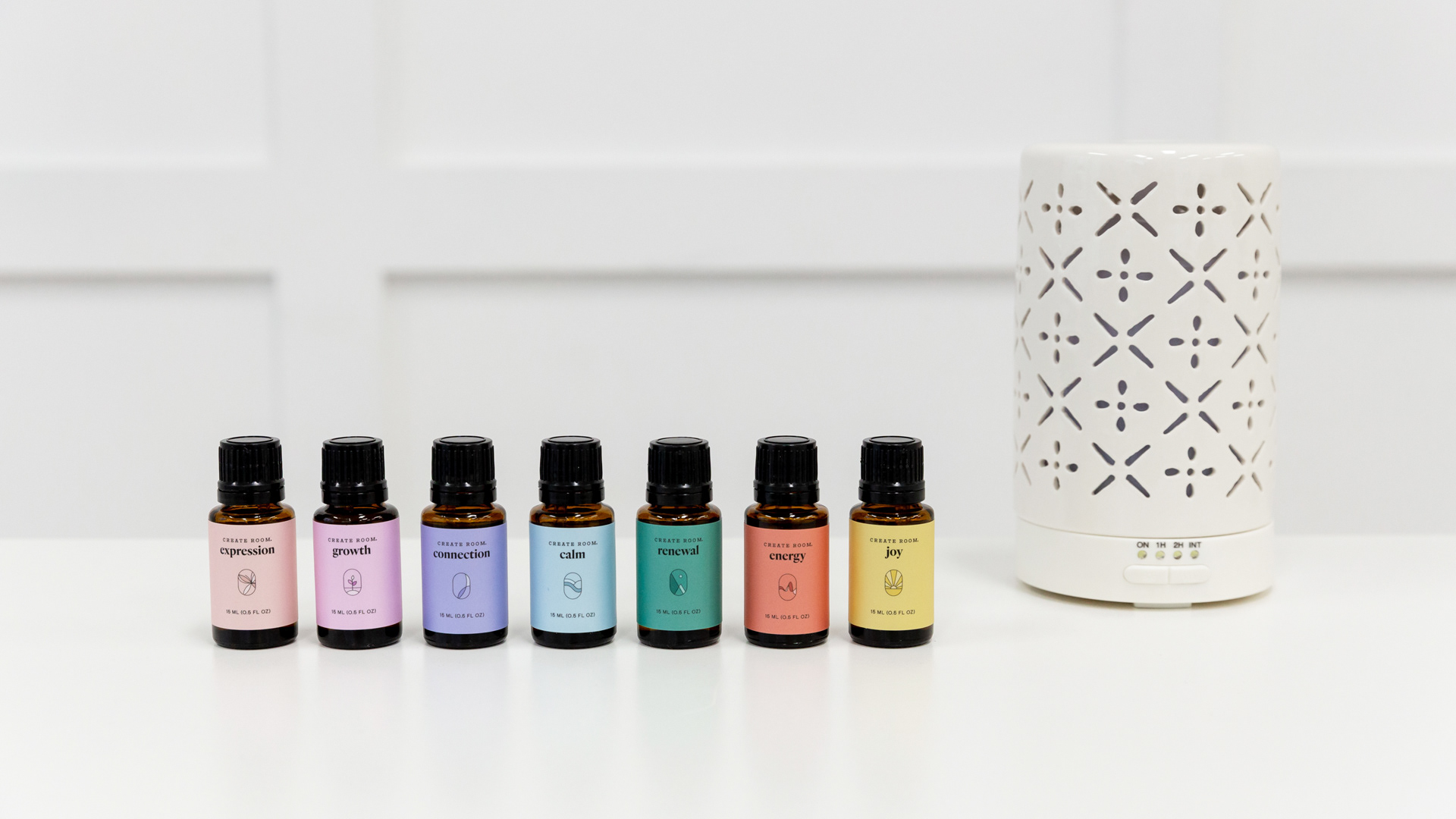
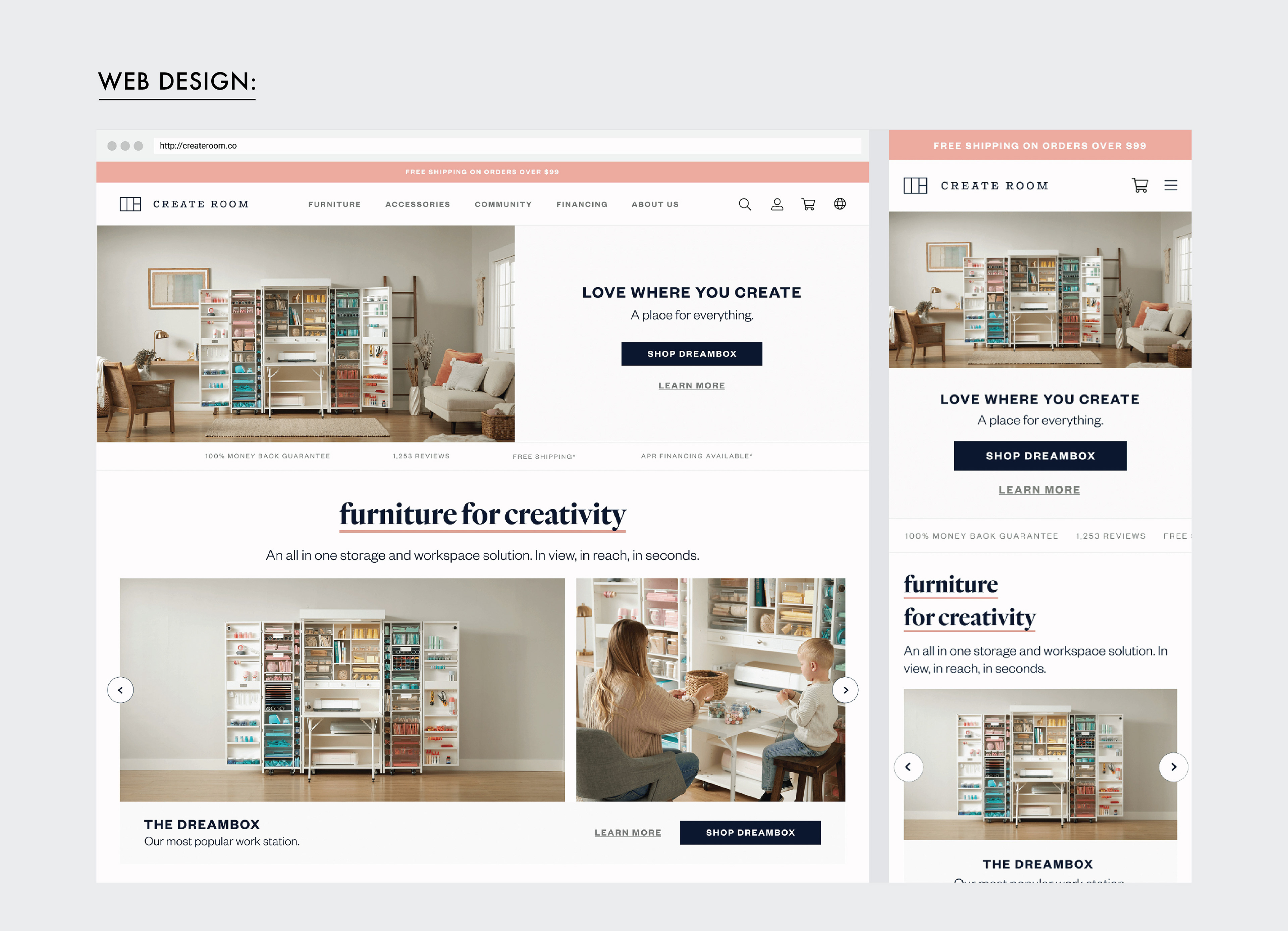
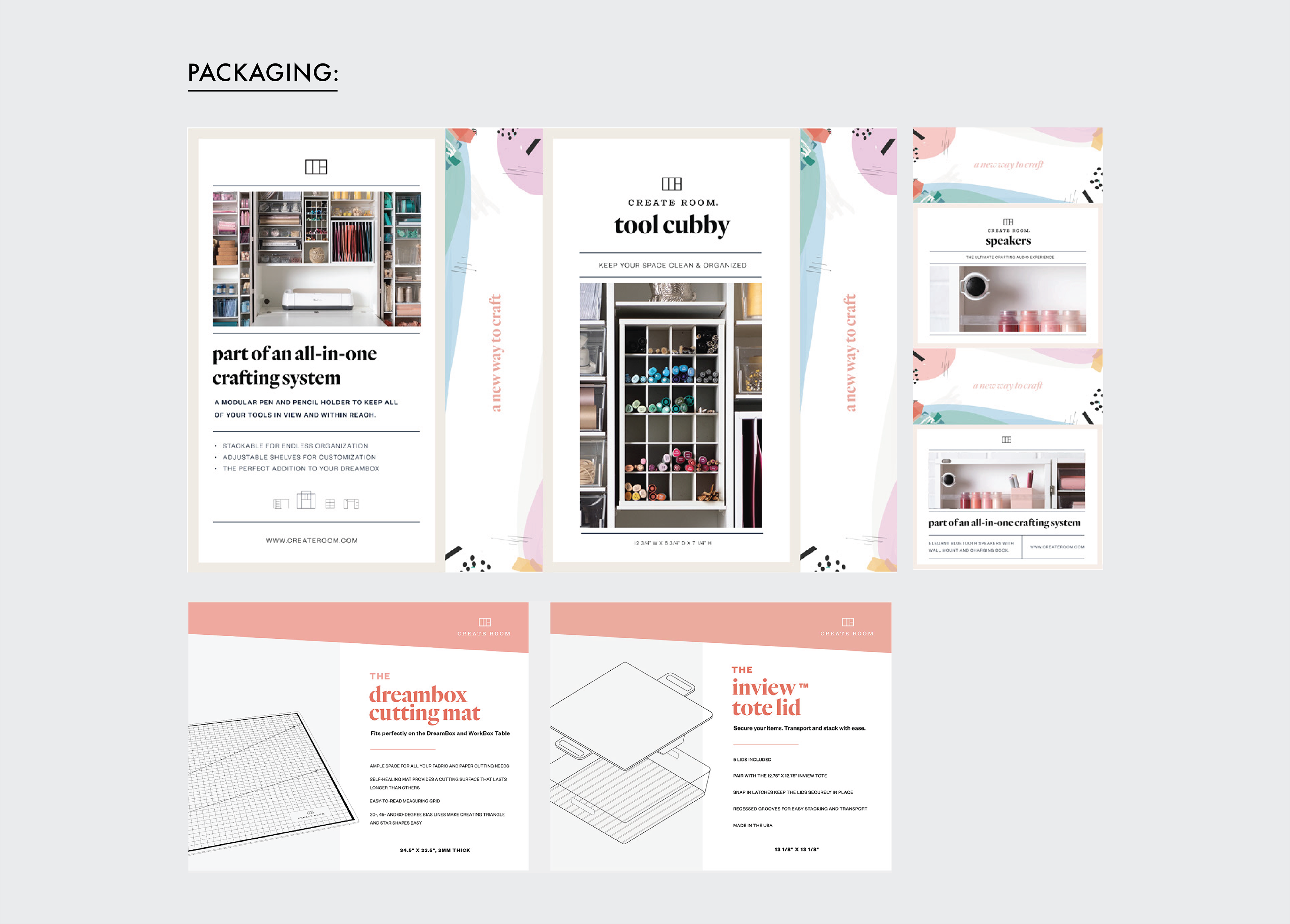
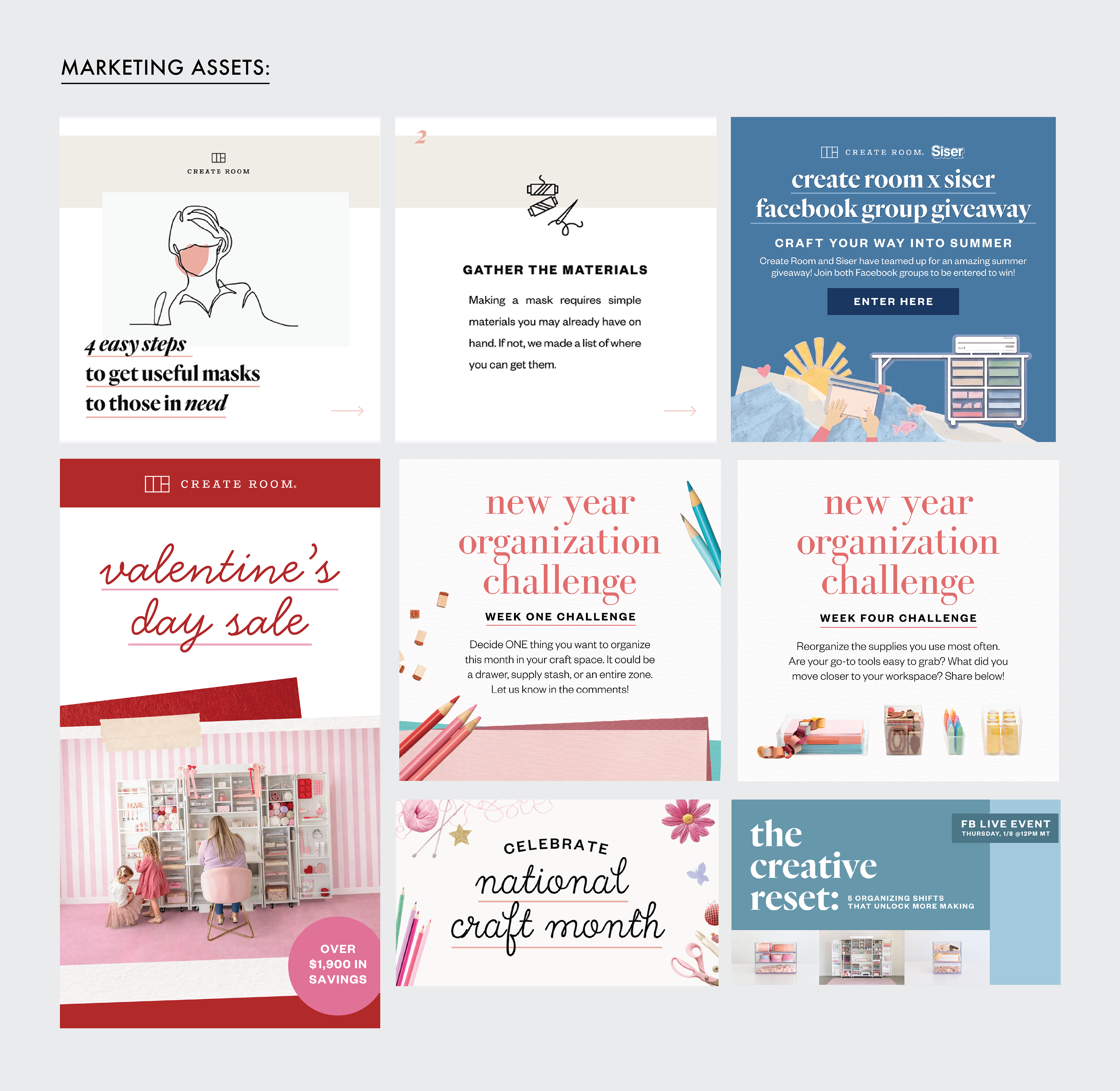
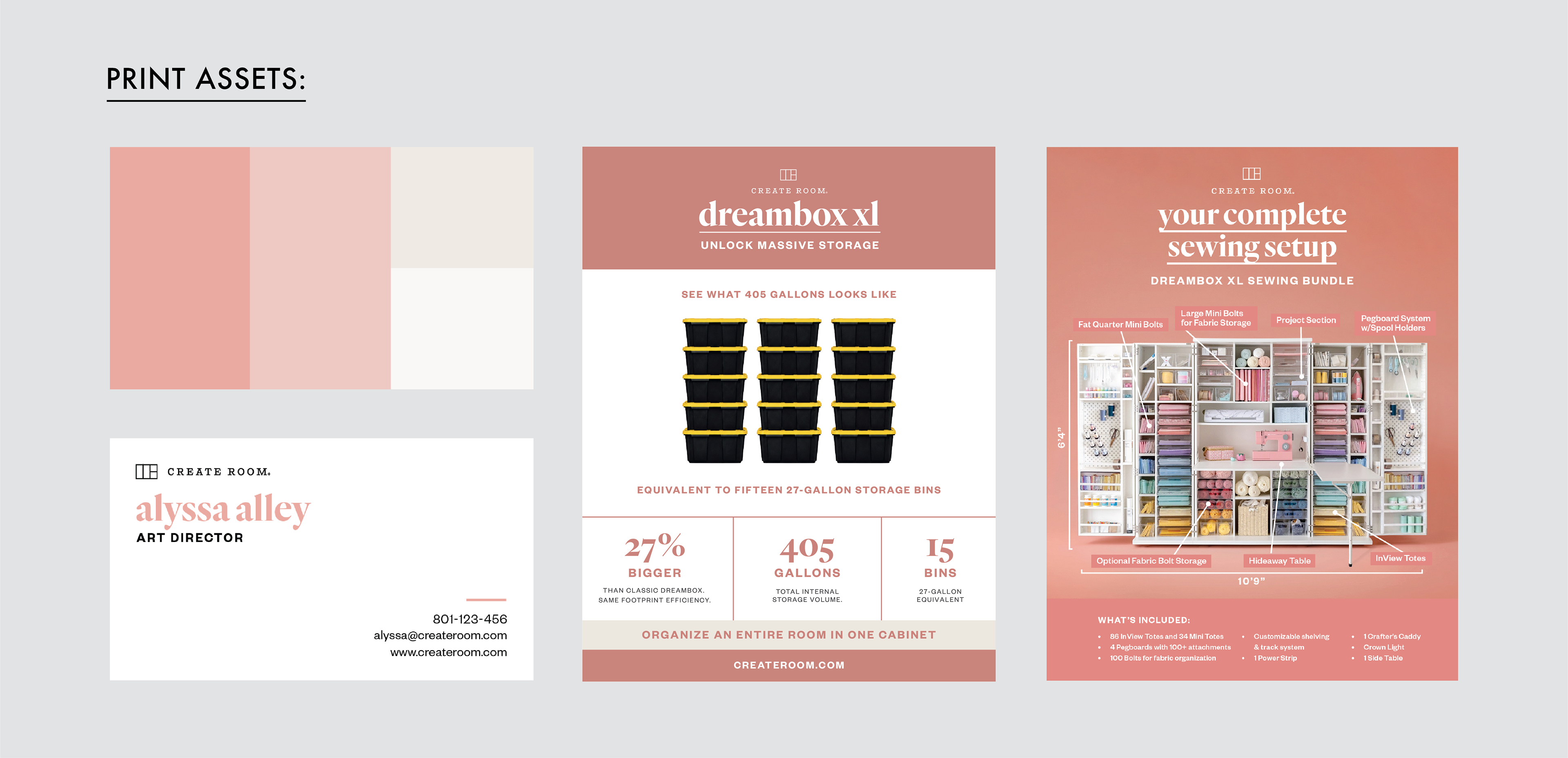
Create Room underwent a company-wide rebrand that required a cohesive visual system across all customer-facing touchpoints, including packaging, web, email, social media, marketing campaigns, advertising, and photography. It included a new logo, brand colors, and design system. The challenge was to unify a growing brand experience while ensuring consistency across a wide range of formats and channels.
As the sole designer executing this project, I was responsible for translating the new brand direction into a complete system and executing it across all touchpoints. This involved prioritizing high-impact customer-facing assets first, then systematically rolling out the identity across remaining brand applications while maintaining consistency and adaptability across formats. The rebrand significantly elevated the company’s market presence, strengthening brand perception and enabling new strategic partnerships that had previously been out of reach. Following the rollout, the company experienced revenue growth in the millions and saw renewed interest from organizations that had previously been hesitant to collaborate under the former brand identity.
This project reinforced the role of design as a strategic business tool, not just a visual exercise, directly influencing trust, credibility, and long-term business growth.
Creator Club (Logo & Branding):
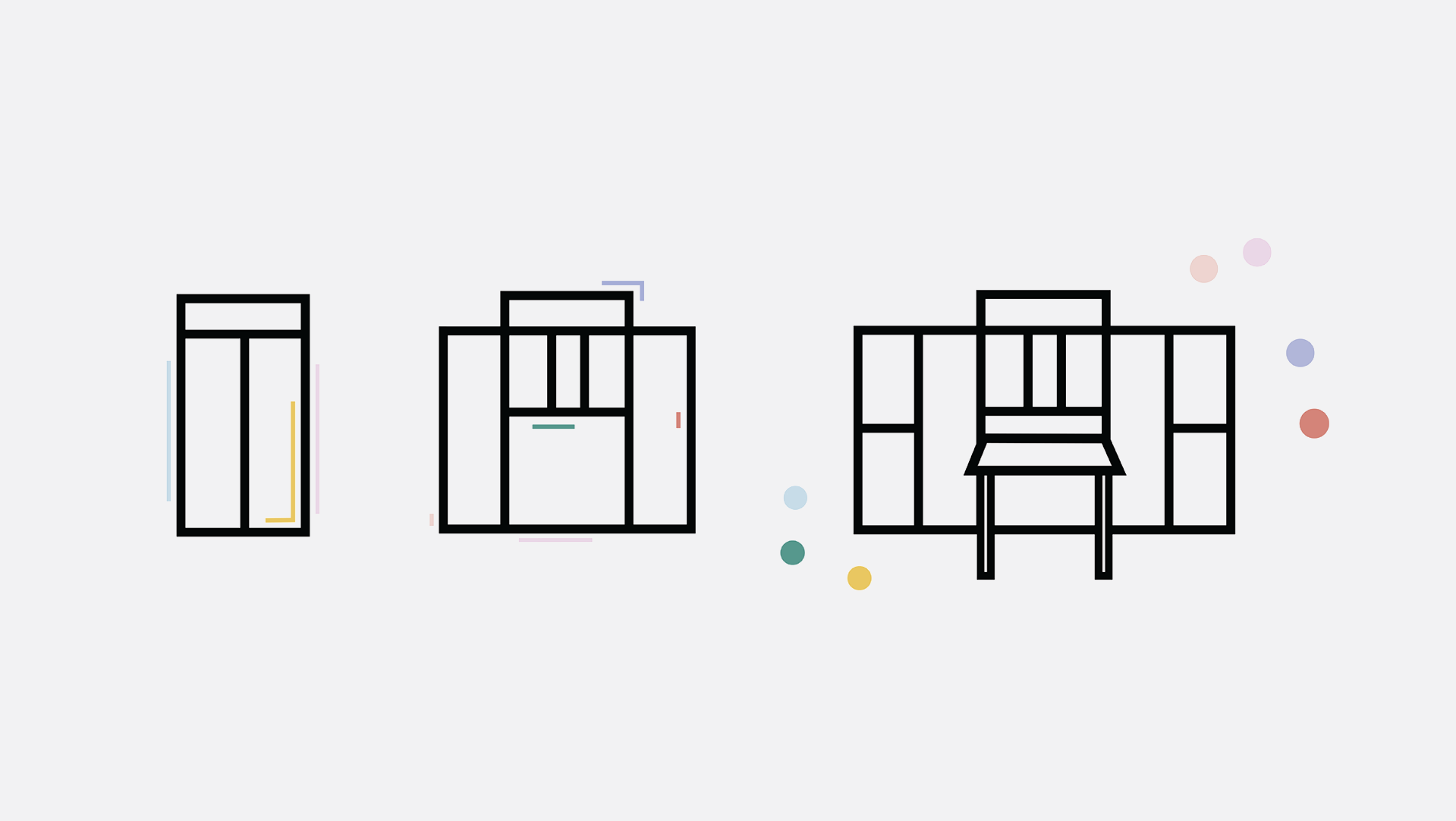
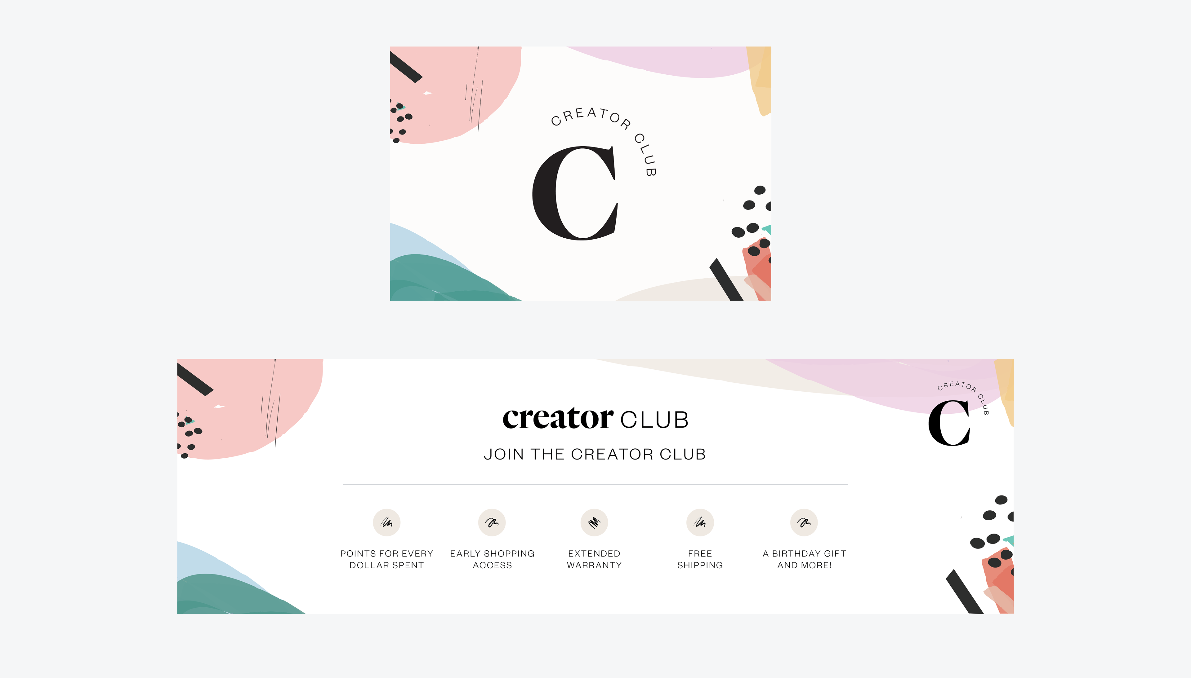
Create Room needed a distinct identity for its rewards and membership program that would feel clear and simple while remaining elevated and connected to the parent brand. I developed a logo and colorful visual system inspired by the diversity of creators, materials, and creative mediums represented within the Create Room community. Designed as a cohesive sub-brand, the identity balances creativity and energy with trust and professionalism, creating a recognizable program that feels both distinct and inherently connected to the larger brand experience.
WellthCare Logo & Branding:
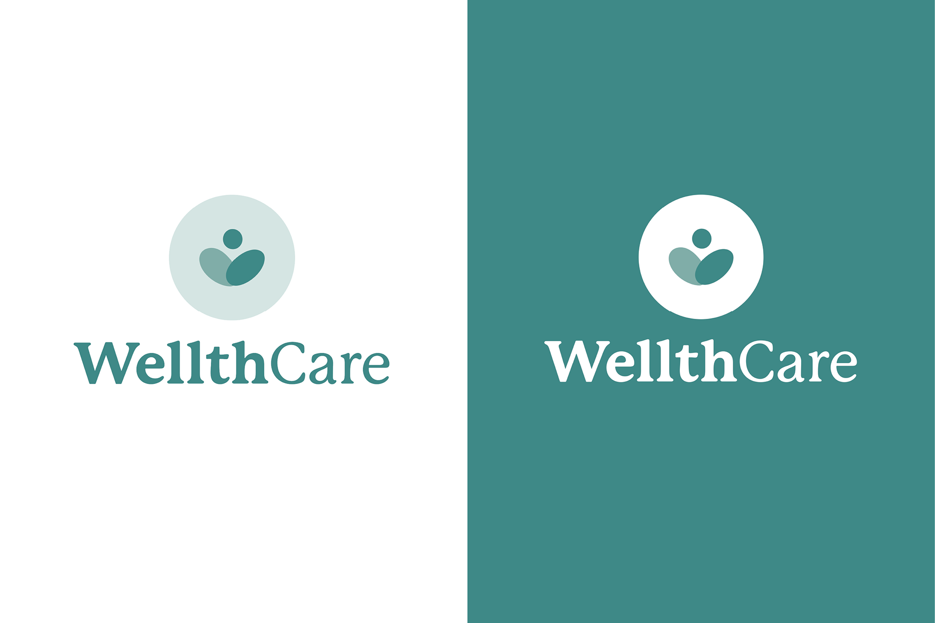
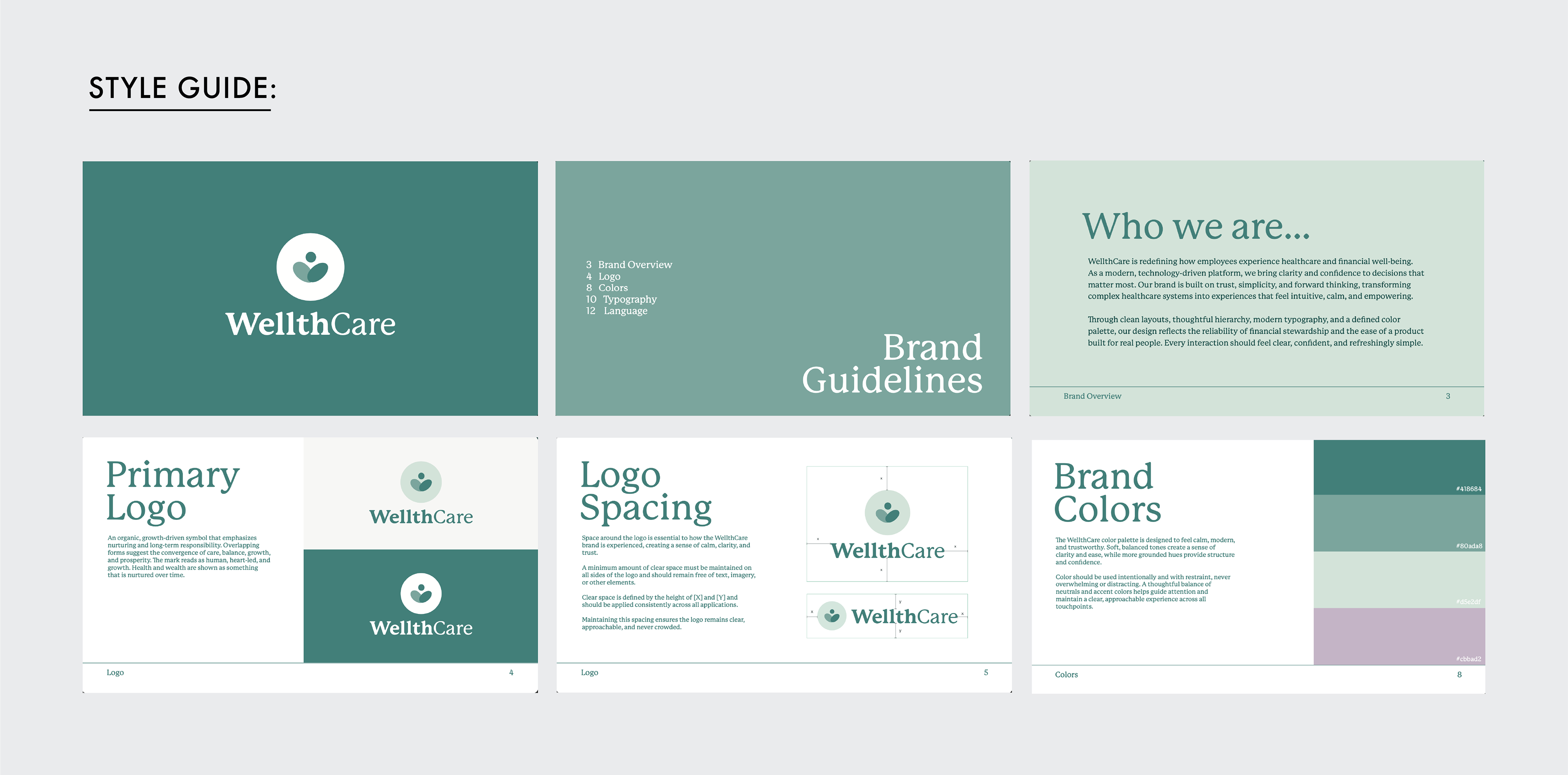
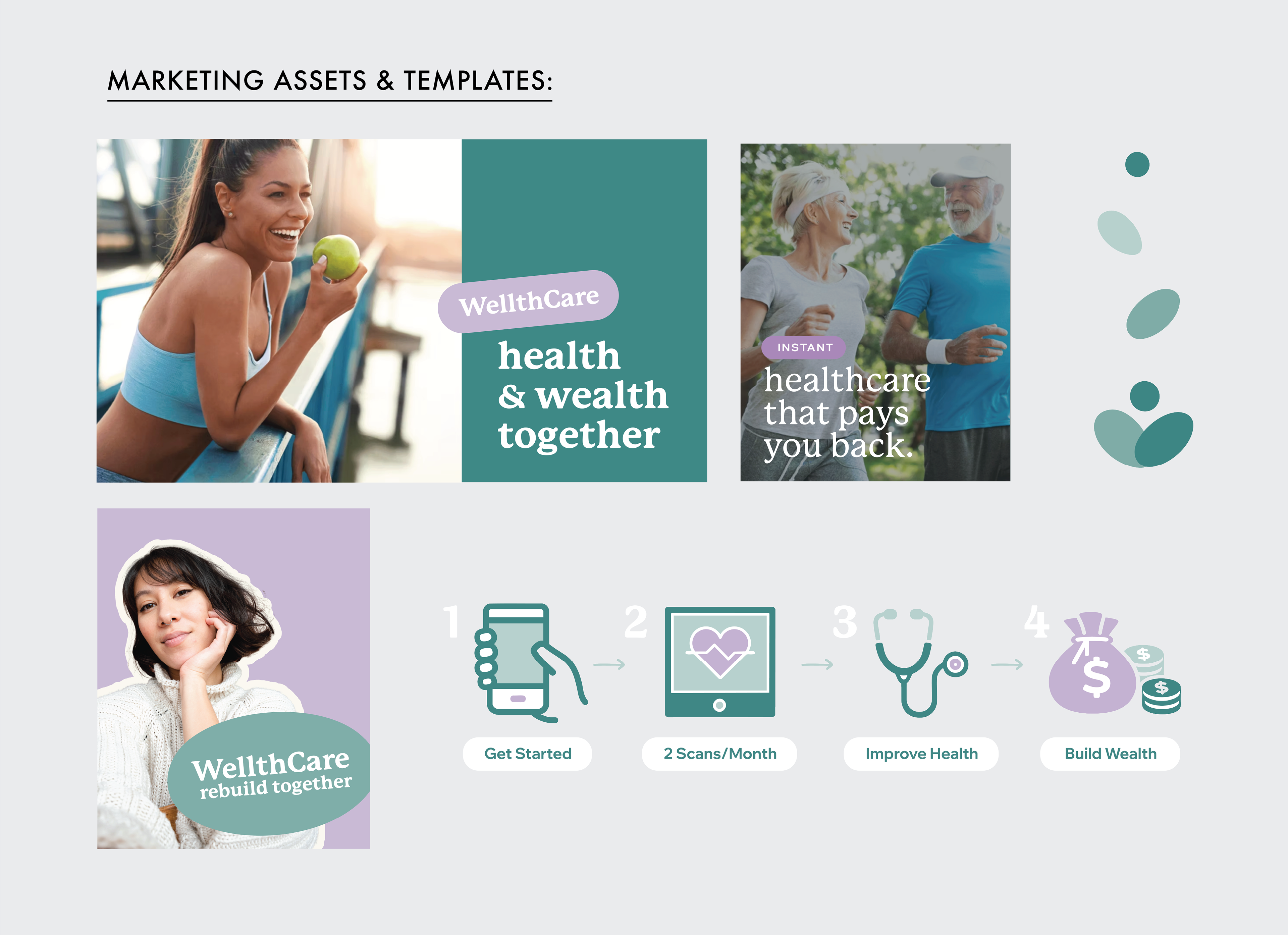
WellthCare's mission sits between two industries that often struggle with perception: healthcare can feel clinical and impersonal, while financial services can feel transactional and profit-driven. The challenge was to create a brand that inspired trust while feeling warm, supportive, and approachable. I developed the logo and visual identity, creating a brand rooted in themes of health, wealth, growth, balance, and support. Through intentional typography, thoughtful composition, and a symbol built from soft geometric forms, I crafted a modern identity that balances credibility with warmth. The visual system communicates trust, stability, and long-term value while remaining approachable, human, and aligned with the brand's people-first mission.
The Recording Kit Logo & Branding:
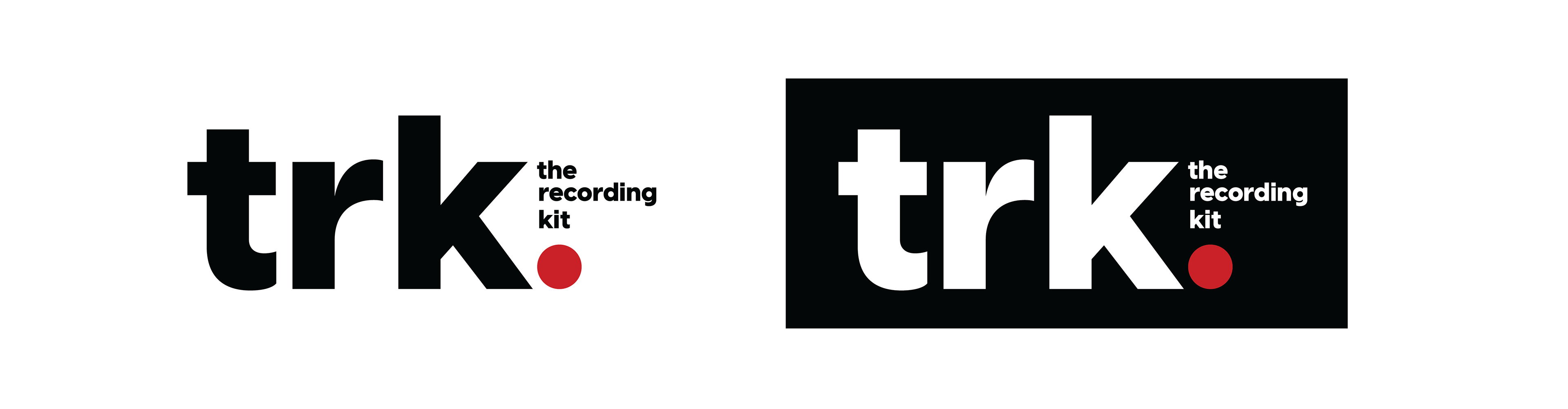
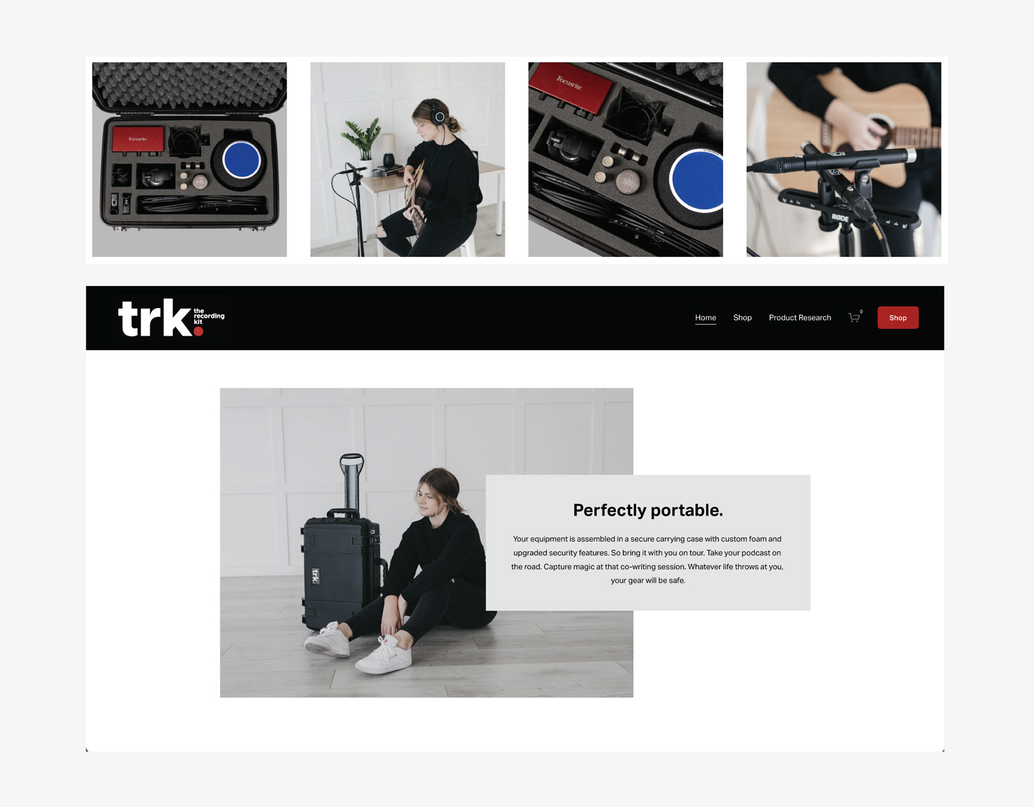
The client wanted a brand identity that felt simple and bold while remaining approachable and accessible. I created a simple but striking visual mark designed to command attention, drawing inspiration from the red recording light commonly found in music and production environments.The result is memorable, energetic, and accessible, reflecting both the confidence and creativity of the brand.
The Copper Cauldron (Logo):
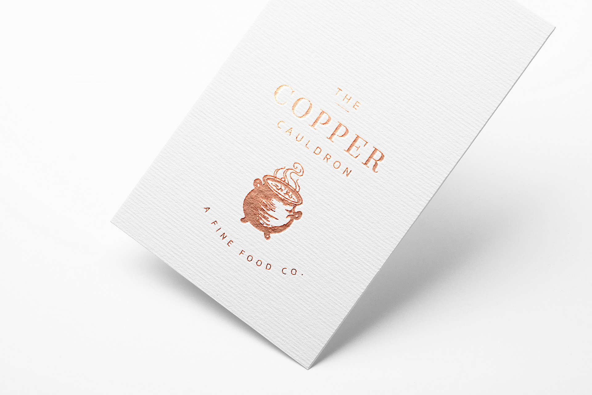
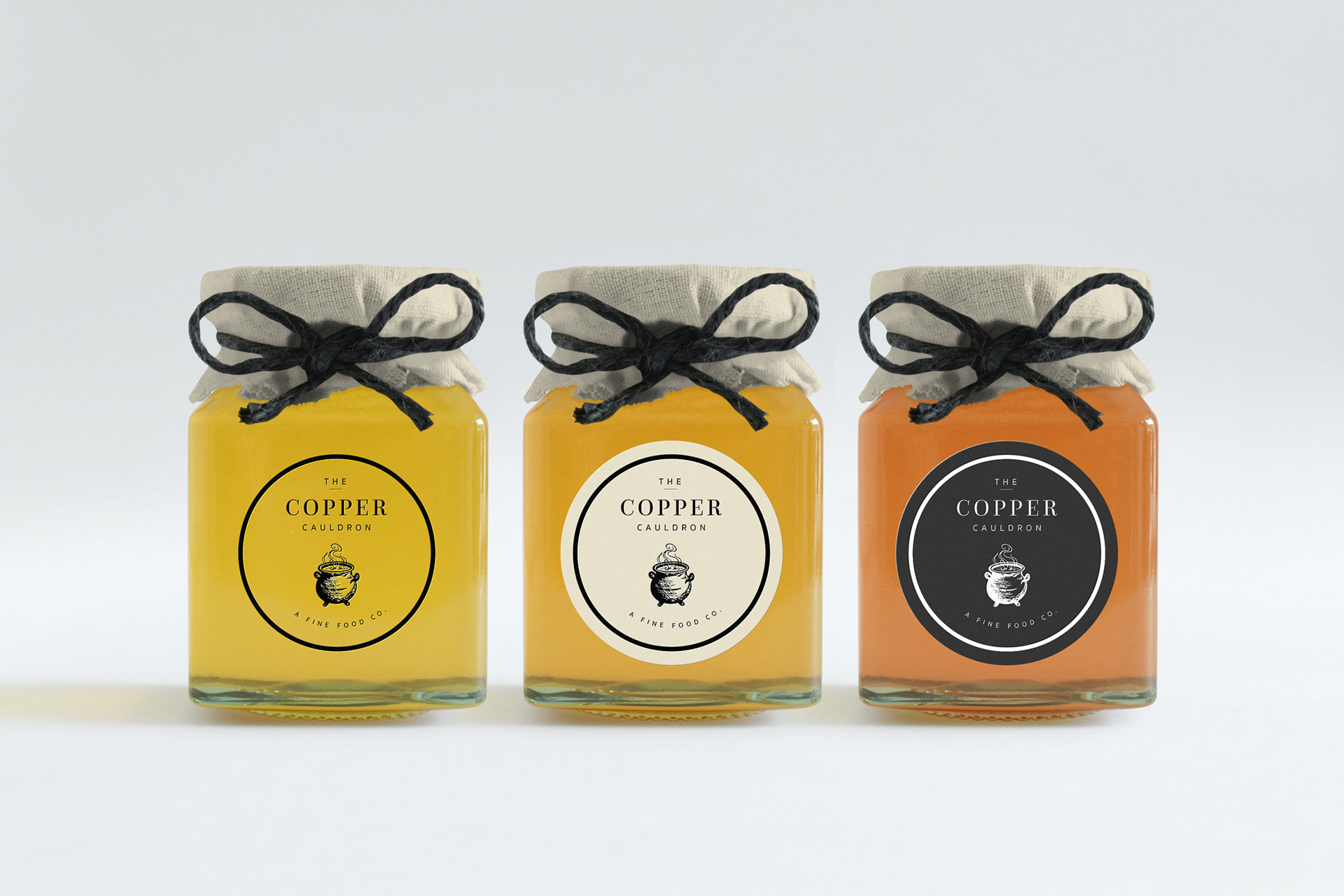
The Copper Cauldron is a fine foods catering company that needed a brand identity that felt elevated, charming, and handcrafted. I designed a custom illustrated cauldron mark paired with a classic serif typeface to balance richness with refinement. The resulting identity feels rooted in tradition while remaining warm, elegant and approachable that reflects the care and artistry behind the food experience.
Sound Bridge Studio Logo:
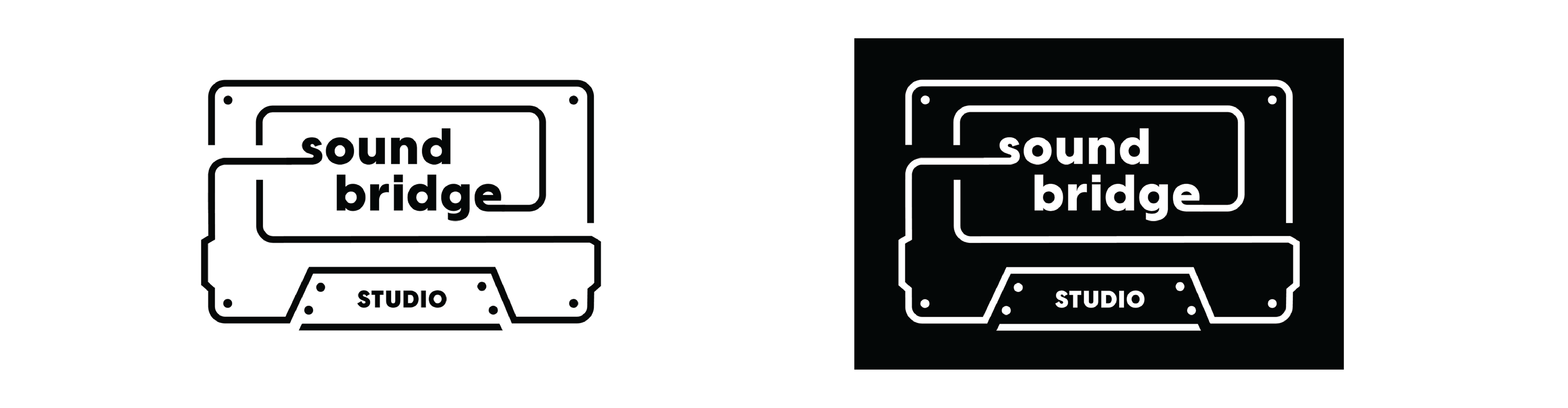
Sound Bridge Studio needed a visual identity that felt human, tangible, and deeply connected to the craft of music. The goal was to steer clear of sterile, overly corporate digital aesthetics and instead celebrate the "analog soul" of real music made by real people. The logo utilizes a simple, continuous path that weaves through the typography, forming a cassette silhouette to honor the warmth and authenticity of analog music. Paired with friendly, lowercase lettering and rounded corners, the identity creates a welcoming and approachable space for artists of all kinds.
Audio Arena:
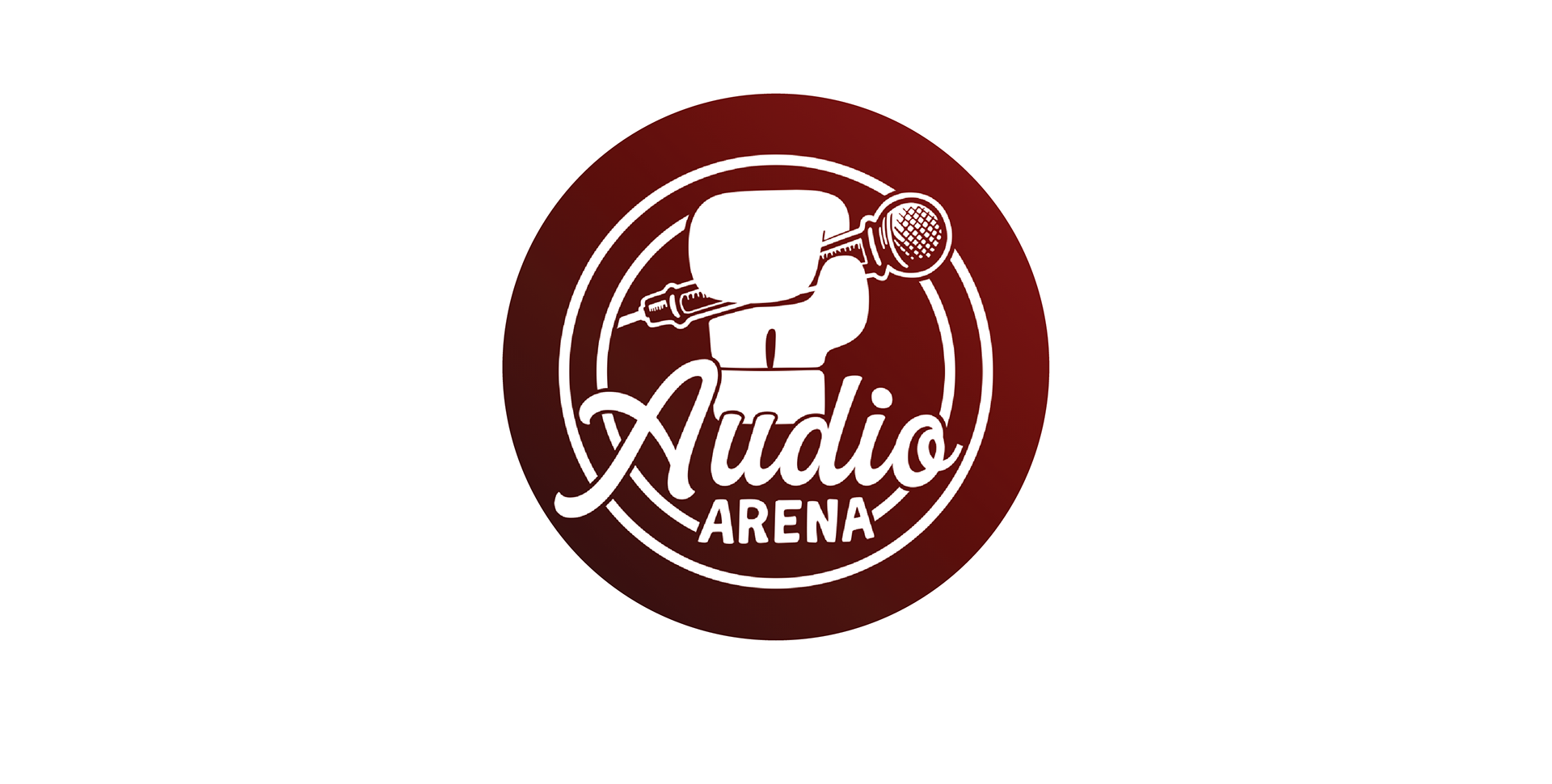
"Audio Arena" is an review-focused YouTube channel sub-brand created for Sound Bridge Studio. Designed for recording artists and audio engineers, the channel hosts head-to-head gear comparisons. The visual identity needed to feel bold, competitive, and fun—leaning into the concept of premium audio gear "battling it out" for the title of studio champion. The central icon features a graphic boxing glove gripping a vintage-style dynamic microphone, instantly signaling the channel's "versus" format. The layered circular borders subtly reference the ropes and layout of a boxing ring, as well as mimicking sound waves. I created an energetic, retro script for "Audio" against a heavy, impactful sans-serif for "ARENA" creates a playful visual tension that feels action-packed yet professional.
Shop Stevie Branding:
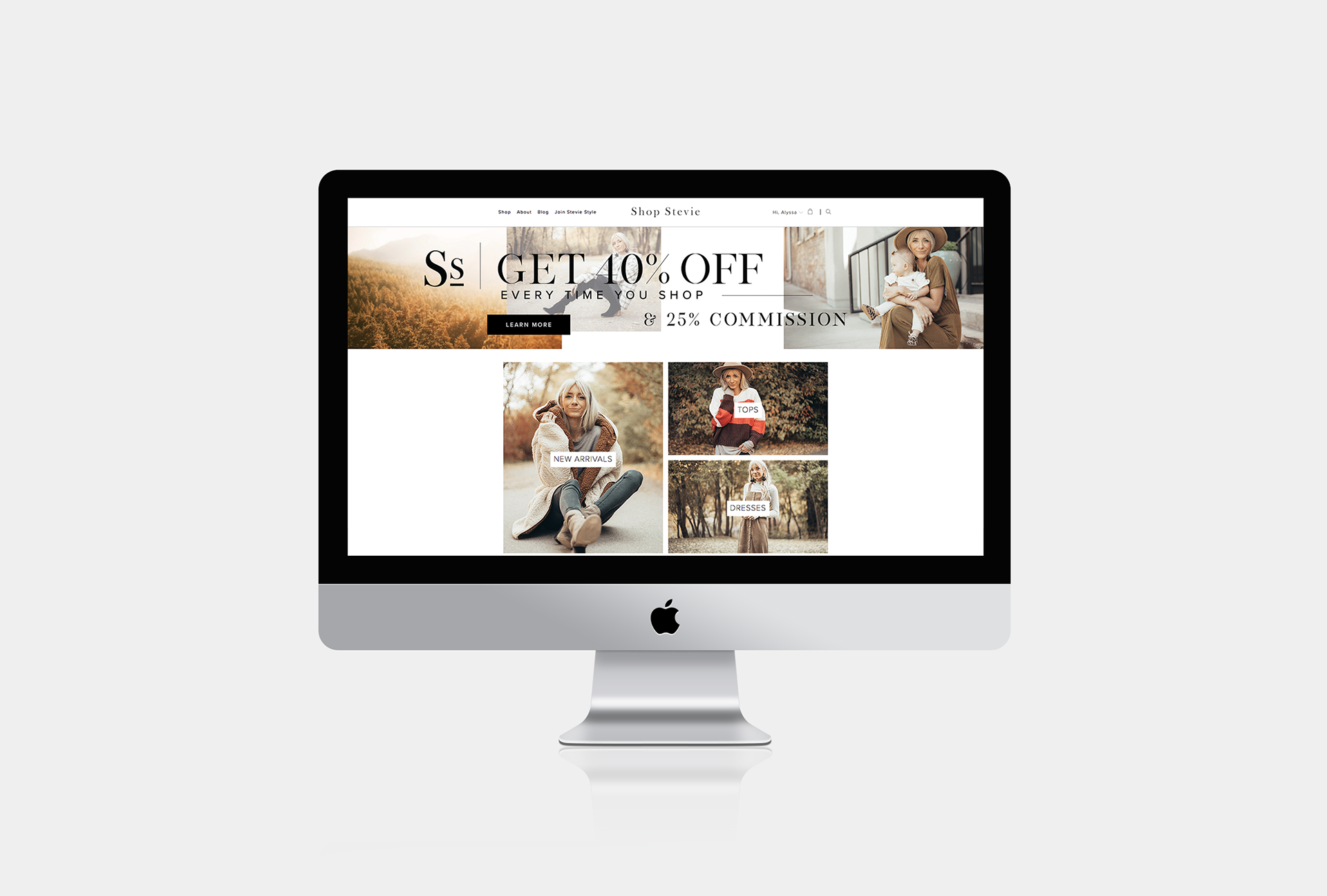
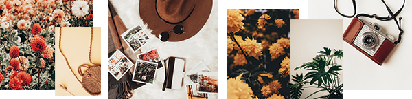
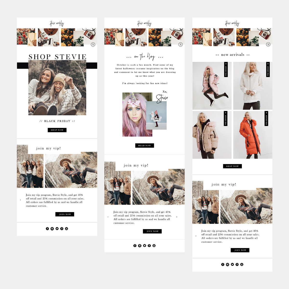
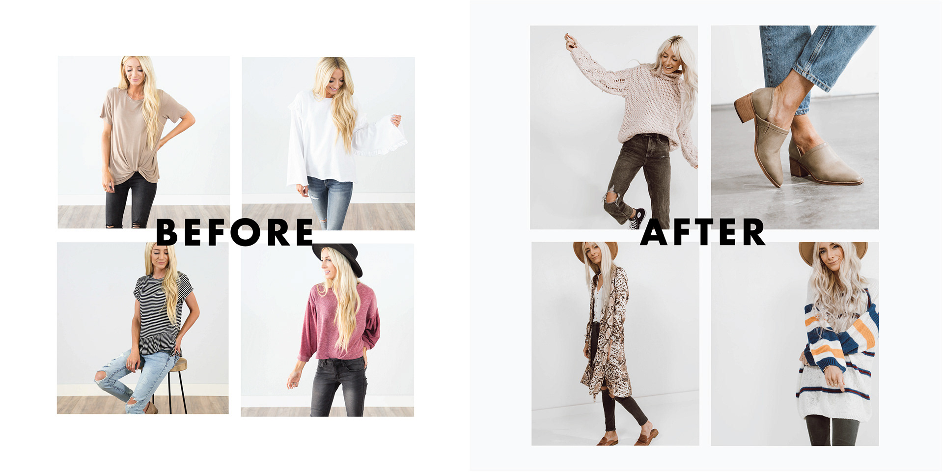
Shop Stevie needed a stronger, more consistent visual identity to reflect a modern, fashion-forward brand direction. Working closely with the founders, I helped define a clear creative direction and establish a more consistent visual identity across all brand touchpoints. I led the development of updated brand guidelines and applied them across digital, social, and marketing assets to create consistency. I also redefined the brand’s visual content approach by directing photography in-house (adjusting lighting, composition, shooting style, and post-production workflows) to ensure all imagery aligned with the new brand standards.
The project resulted in a more unified brand system with a clear, elevated visual language across both design and photography.
Stevie Style Logo:
Stevie Style is the VIP membership program for Shop Stevie, designed as a sub-brand that needed to feel clearly connected to the core brand while still signaling exclusivity and distinction. I designed a clear, bold wordmark using the same typographic foundation as the primary Shop Stevie identity to maintain cohesion and recognition across the brand ecosystem. The resulting system creates a seamless extension of the main brand while giving the membership program its own distinct presence.
The Treetop Inn:
The client wanted a logo that captured the charm and character of their unique treehouse Airbnb while feeling warm, inviting, and storybook-like. Drawing directly from the architecture of the actual treehouse, I created a custom illustrated mark that reflects its distinctive structure and sense of whimsy. The resulting identity evokes nostalgia, adventure, and comfort, helping guests connect with the experience before they even arrive.
Kasper’s Bakeshop Logo:
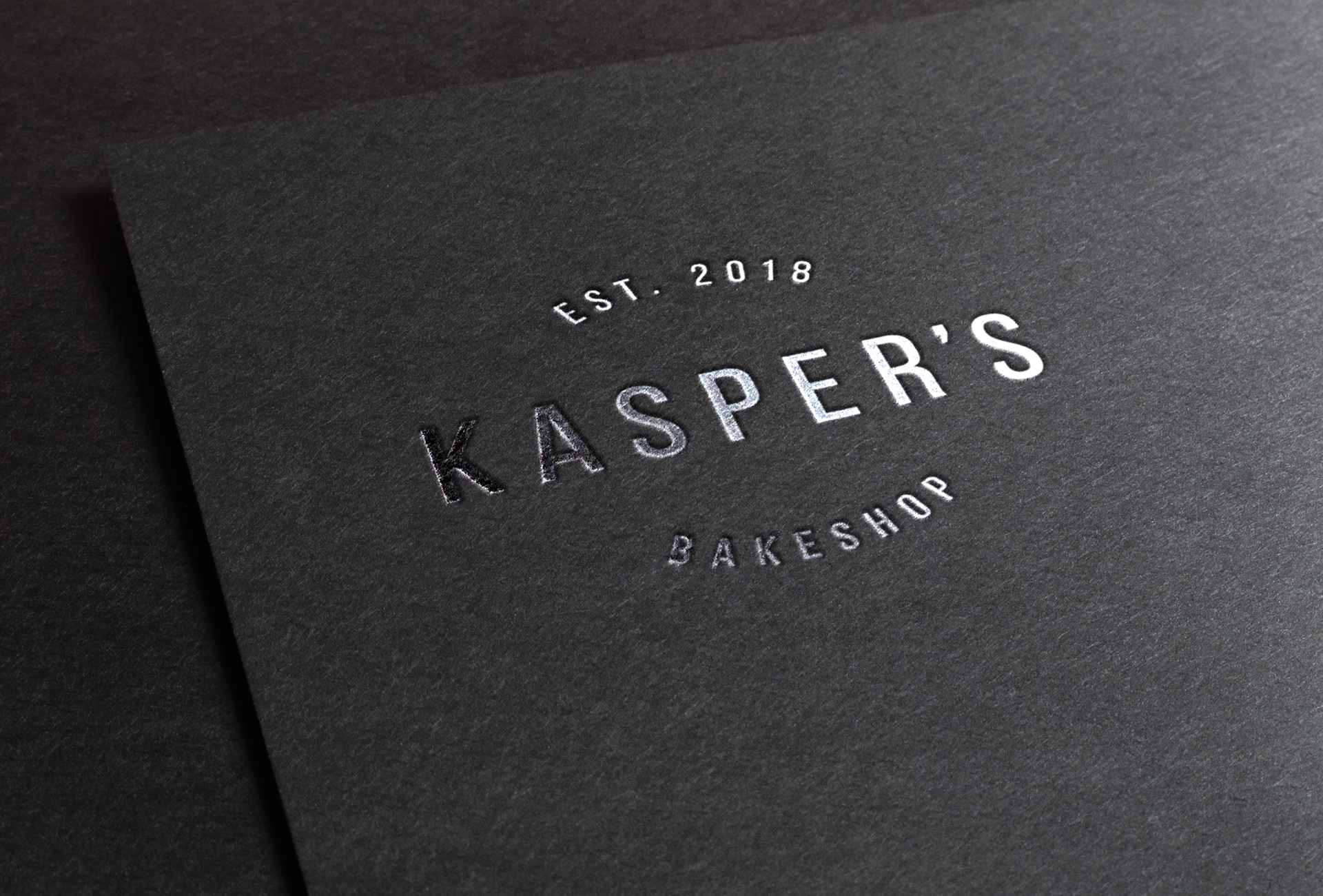
Kasper’s Bakeshop is a food truck bakery that needed a simple, clean, and professional wordmark that would be easy to recognize and flexible across a mobile, fast-moving environment. I designed a refined typographic logo focused on clarity, legibility, and balance, creating a brand mark that feels approachable, trustworthy, and well-crafted.